“So You’re Considering the Dark Side”
The Professional Development Committee continues its ongoing series featuring TOCA Gardner award winners.
“So You’re Considering the Dark Side”
Gardner Award Winner for Photography, Video and MultiMedia — Publishing
by Jennifer Klemmetson, TOCA professional development committee
We asked Seth Jones, editor of Golfdom, the following questions:
Please briefly describe your winning project.
Golfdom publisher Pat Roberts suggested we do a roundtable discussion with former superintendents who have left their jobs to take sales jobs — commonly referred to as “going to the dark side.”
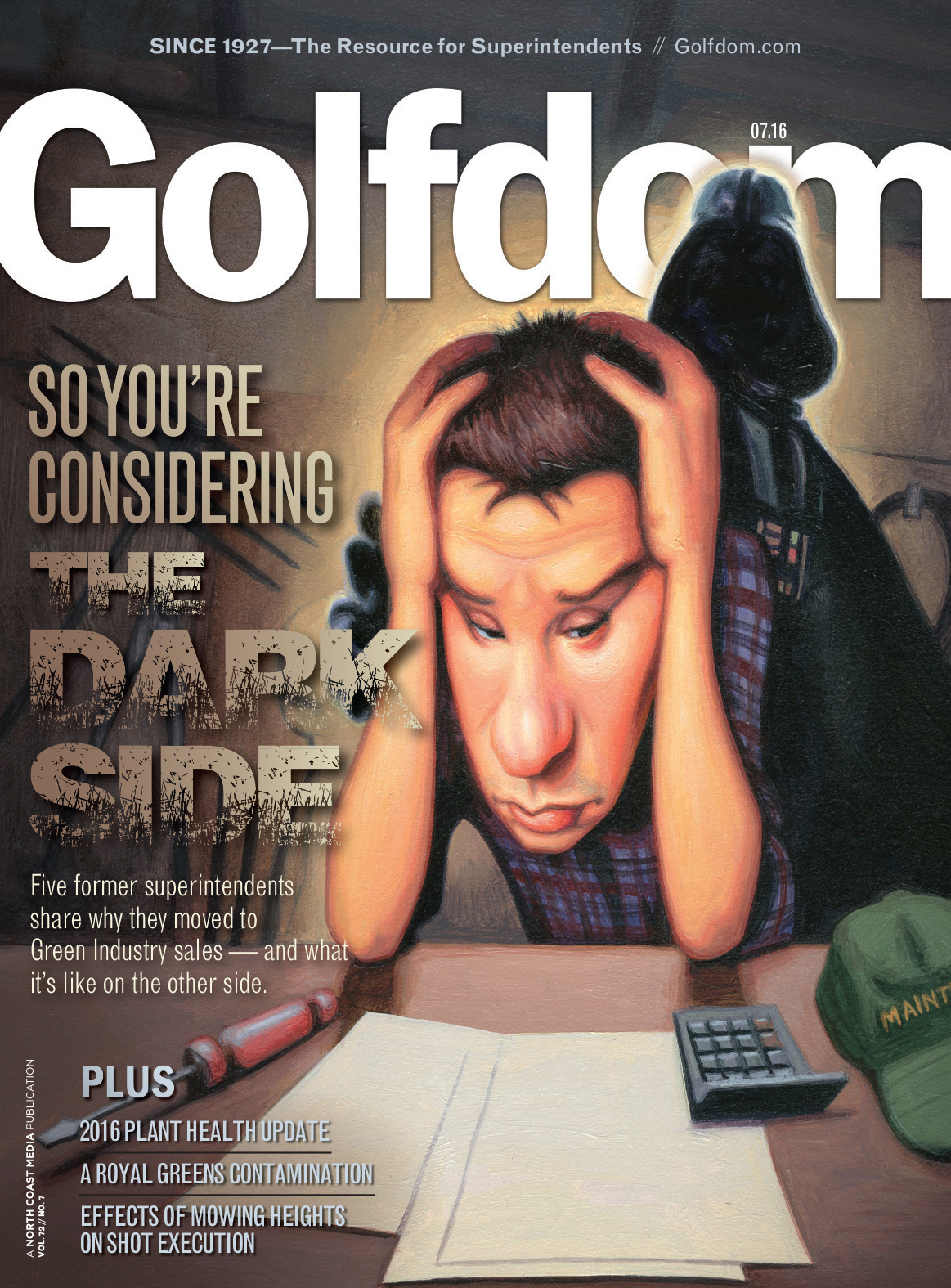 Five guys sitting around a table isn’t an exciting, grabbing image for the cover. So we had to get creative with the cover concept. I sketched out an image of a stressed out superintendent sitting in his office with a shadowy figure behind him, reaching out to him. I took a photo of it and texted it to our designer, Pete Seltzer (he lives in Ohio, I’m in Kansas) and asked him if he thought an illustration like this would work for the cover, if we found the right artist. He liked the idea and went on the hunt for the perfect artist. He found James Bennett (JamesBennettArt.com), a talented artist who has done covers for Sports Illustrated, Golf Digest and Mad magazine, among others.
When the image came back from James, I knew right away that we had something special.
What were your main objectives in developing this project?
People do judge books by their covers. Every month I want Golfdom to have the best, most eye-catching cover in the industry. My concern is always this: if we have a boring cover, people won’t be compelled to open the magazine and read it. What’s the point in doing all that work on the content inside the magazine if we don’t compel the reader to open the magazine as soon as he/she gets it?
I wrote the story, it was done, I thought it was a solid Q&A. But without the right cover image, we risk the reader setting the magazine in the “to read later” pile on the desk… and they may never come back to the magazine again.
So my main objective — as it is every month with our cover — was to have a cover that made the reader want to open the magazine as soon as he or she received it.
What influenced your approach?
People who know me know that I’m a big popular culture/science fiction fan. I was out on the golf course last week and one of my playing partners thought it was hilarious that my wallet has Batman on it. My two other playing partners were not surprised at all (and in case you’re wondering, I do rotate wallets between Batman, Captain America and Spider-Man.)
I thought readers would enjoy the popular culture reference of Golfdom tipping its cap to the dark side.
Please tell us what you think stood out in your winning entry.
The cover was 100% original… it was not a stock art image, or some cover that relied on words in funky fonts to spell out for readers what was inside. It was a cover that we imagined, then commissioned, hiring a “big deal” artist to do the artwork. I think when our readers see something like that, it makes them take notice that Golfdom isn’t messing around… we want their time and attention, and we’re willing to make significant investments in order to earn their time and attention.
All credit goes to Bennett, the artist, and Seltzer, the designer, for taking my lousy sketch and turning it into a real work of art.